
Reference
Chanel Project
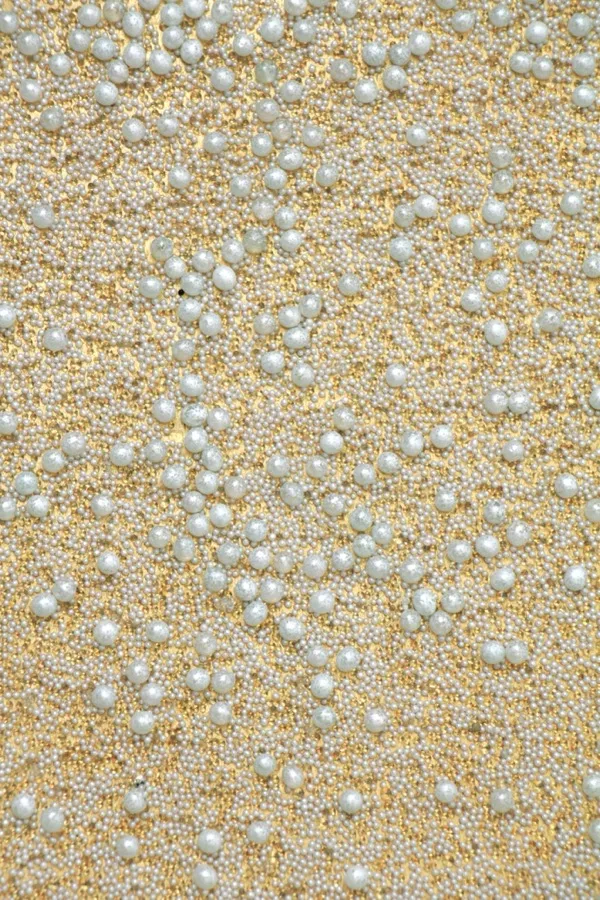
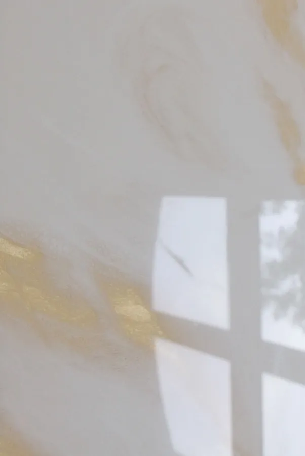
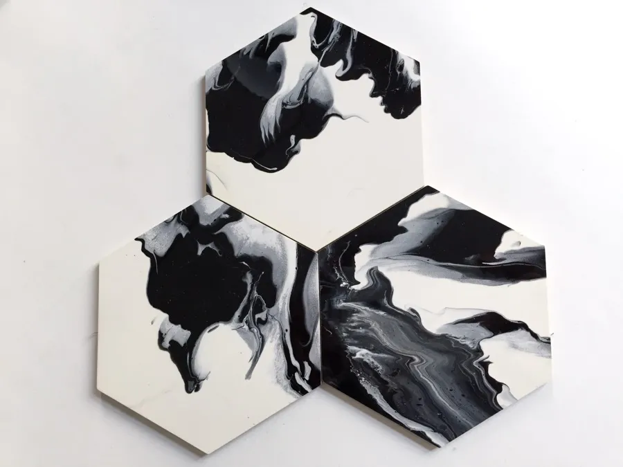
Individual surfaces for Chanel boutiques worldwide — in black, white and gold.
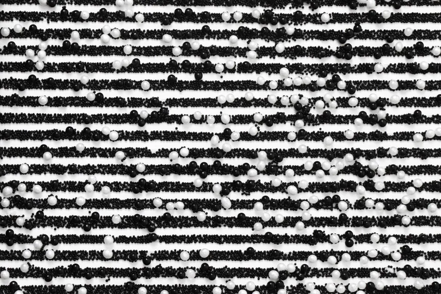
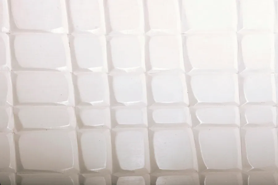
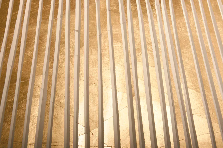
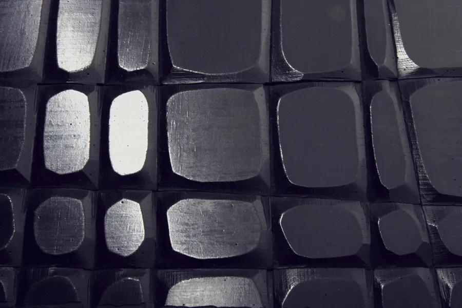
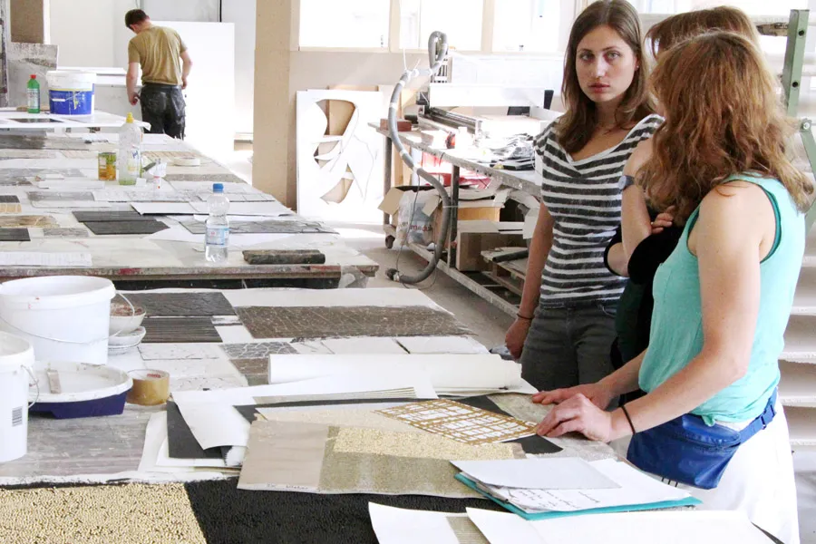
The colours of Chanel are black, white and gold. The textures are organic, but ordered. With this brief, Welter was asked to develop surfaces for walls, furniture and displays for Chanel-owned stores. Drawing on the manifold techniques and materials, Welter's designers were able to create a varied range of surfaces.
A visual language of black, white and gold
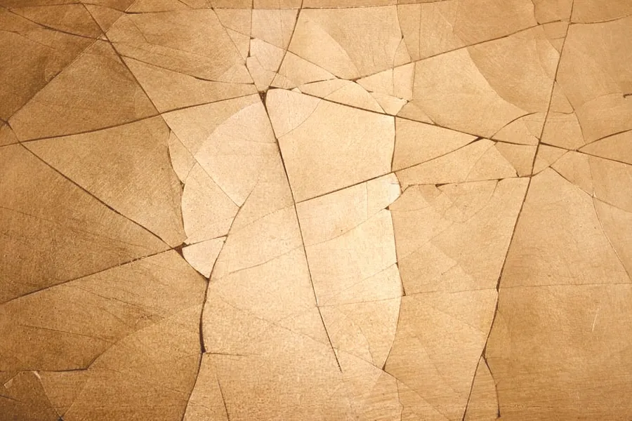
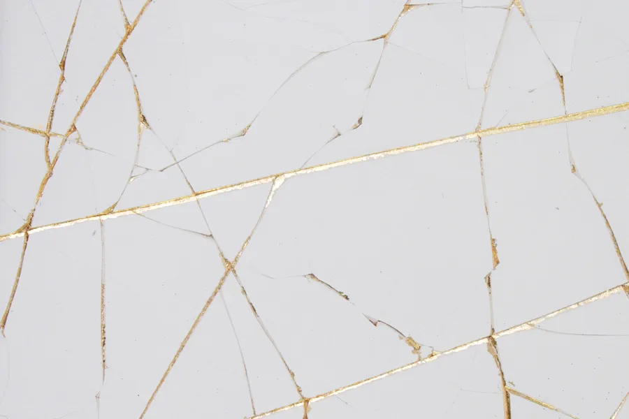
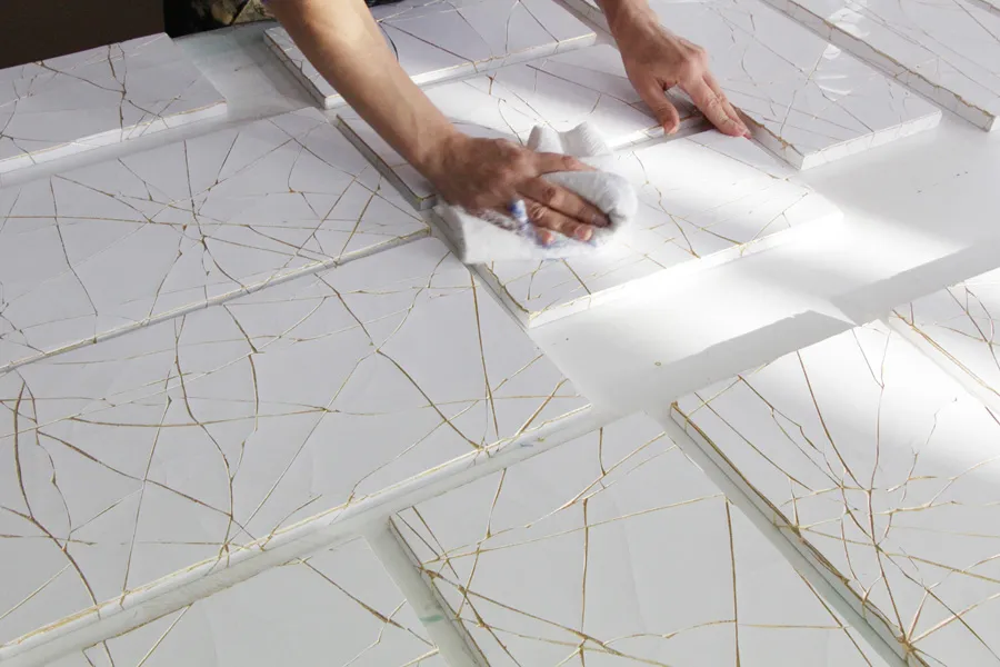
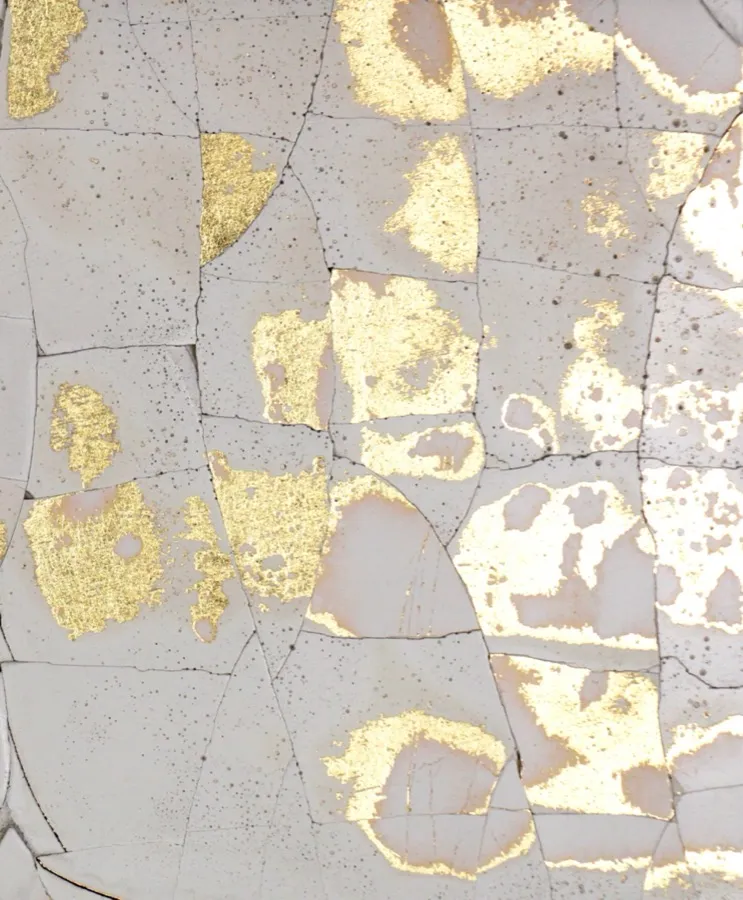
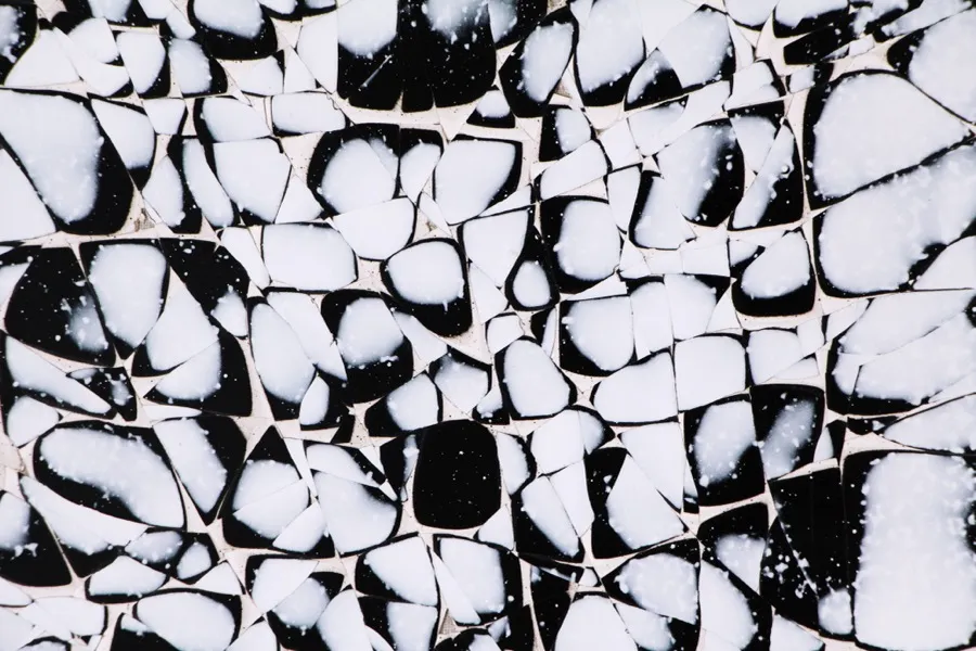
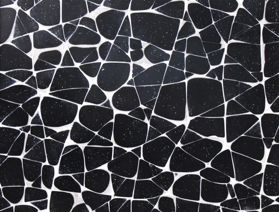
The brief was as clear as it was reduced: three colours, organic yet ordered textures, a surface that belongs to the brand without placing itself in front of it. Welter’s answer led by way of craquelure – a manufacture technique in which a controlled, cracked surface of many small breaks yields a quiet, yet lively image. From this vocabulary, the designers developed a series of custom-made works that translate the brand’s black, white and gold into their own particular light.
The Wandunikate that emerged join wall, furniture and display into a continuous gesture. A craquelure surface that begins as a floor-to-ceiling wall can continue as the front of a vitrine and finally end as the body of a display – material, colour tone and surface treatment remaining in one hand. In this way an atmosphere emerges in which individual objects do not vie for attention; the room itself becomes the stage of the brand.
The surfaces are made in the Berlin manufacture and from there delivered to Chanel boutiques worldwide.